
Varo Bank
Rewriting registration
to cut drop-off
- UX research
- UX writing
- Brand voice & tone
- Company
- Varo Bank
- Project
- F30 Registration
- My role
- UX Writer
- Partners
- Product, Research, Legal, Design, Engineering, Marketing
Overview
When Varo Bank rolled out a rebrand, the design org kicked off F30, an initiative to improve customers’ first 30 days. The goal was to bring the new brand into the app while improving key metrics: applications, debit card activations, linked bank accounts, and direct deposit setups.
The UX team started with the registration flow. As the UX writer, I owned the content strategy and product copy.
Problem
40% of people who started a Varo Bank Account application abandoned it before finishing. Each one was a customer Varo lost before their first 30 days even began.
Approach
Identify areas of drop-off
We needed to find out where and why applicants were giving up, so I mapped the user journey to understand the decisions and tasks applicants faced at each step.
Key finding
Working with the data team to check click-through rates by screen, we found that the biggest drop-off was at phone and email verification, with 30% of users abandoning the application when they reached those steps.
Optimize the application
We needed to reduce both actual and perceived effort, but engineering constraints meant prioritizing structure and content over new functionality. Within those limits, we reworked the form in four ways:
Actual effort
Fewer fields
Asked only for what the application required, and worked with Legal on which opt-ins, notices, and disclaimers had to stay.
Save and resume
Let users leave without losing progress, with email reminders to bring them back.
Perceived effort
Chunking
Grouped related fields on the same screen to reduce context switching.
Commitment escalation
Started with easier questions and moved sensitive ones, like Social Security number, later in the flow, once users were invested.
Set the content strategy
Applicants were overwhelmed and hesitant to share personal information, so I created a content strategy that addressed these struggles and reflected the new brand.
Content strategy
- Reduce frictionClearer, more straightforward instructions. Remove obstacles.
- Lessen cognitive loadMinimal design with the right amount of context. No more, no less.
- Build trustSet correct expectations. Be transparent.
- Establish brand identityApply the voice principles: simple, straightforward, and inviting.
Creating voice principles
Varo’s new voice was already live in marketing, but the product style guide still reflected the old brand. Working with Marketing, I updated it to bridge the two, keeping principles that still worked, like straightforward, and adding ones from the rebrand, like inviting.
Simple
but not technical
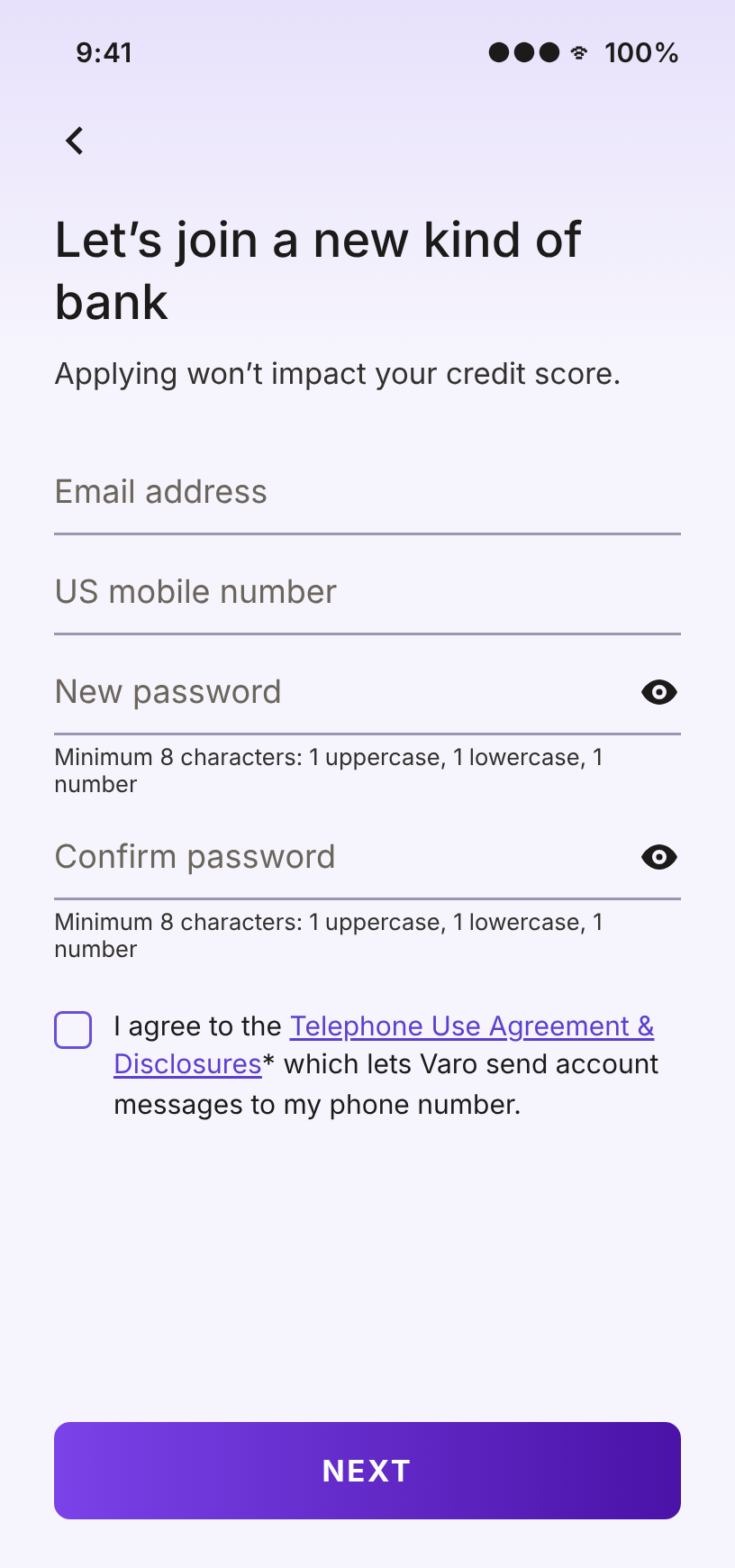
“Applying won’t impact your credit score.”
Straightforward
but not indifferent
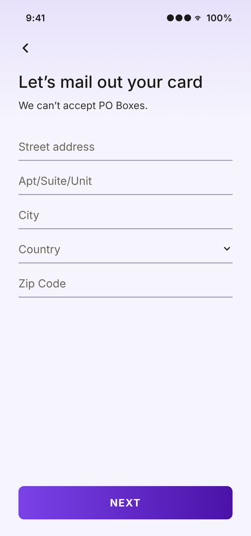
“We can’t accept PO Boxes.”
Inviting
but not cheesy
“Let’s join a new kind of bank”
Adapting tone across the flow
The voice stayed the same on every screen, but the tone shifted with the task. On phone and email verification, I dropped “let’s” so that clarity came before personality.
Outcome
The redesigned flow shipped with new copy on every screen. Research tested it through A/B tests and user sessions. The voice principles and updated style guide became the foundation for the rest of F30, as the team moved on to other parts of customers’ first 30 days.
First two months
40% → 28%
application abandonment rate
Before and after
Select a screen to see the before and after.
Step 1 of 5
Create your login
You’re on your way to a new kind of bank
Apply for a Varo Bank Account today. It won’t impact your credit score.
Email address
US mobile number
New password
Minimum 8 characters: 1 uppercase, 1 lowercase, 1 number
Confirm password
I agree that Varo may send account messages to my provided phone number(s) including SMS message for One-Time pin codes via calls, texts, or pre-recorded messages. Telephone Use Agreement & Disclosures.*
Let’s join a new kind of bank
Applying won’t impact your credit score.
Minimum 8 characters: 1 uppercase, 1 lowercase, 1 number
Minimum 8 characters: 1 uppercase, 1 lowercase, 1 number
I agree to the Telephone Use Agreement & Disclosures* which lets Varo send account messages to my phone number.
Less daunting legalese, more concise copy, a clear CTA that sets expectations, and an inviting headline that conveys partnership.
Step 2 of 5
Tell us about yourself
Home address
Enter the address where you live, a military post office (APO), or a rural route (RR). We can’t accept PO Boxes.
Street address
City
Country
Zip Code
Let’s mail out your card
We can’t accept PO Boxes.
Removed home vs. mailing address confusion, provided value instead of collecting info, used inviting “let’s” language.
Step 1 of 5
Create your login
We sent you a text message
Enter the 6-digit code we sent to your phone number ending in [XXXX].
REQUEST A NEW CODE
By verifying your phone number, you help us keep your account secure.
Varo Bank, N.A. Member FDIC.
© 2021 Varo Bank, N.A. All Rights Reserved.
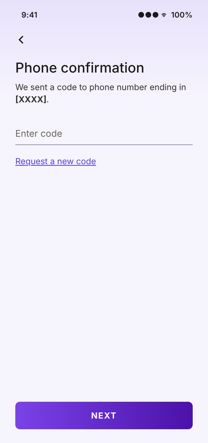
Phone confirmation
We sent a code to phone number ending in [XXXX].
Request a new code
Autofill, a straightforward headline, removed the security tip, and dropped “let’s” to prioritize clarity.
Step 1 of 5
Create your login
We sent you an email
Click on the link we sent to your email at jaimesmith@gmail.com.
You can also verify your email with the code provided in the email we sent you. Enter code.
Varo Bank, N.A. Member FDIC.
© 2021 Varo Bank, N.A. All Rights Reserved.
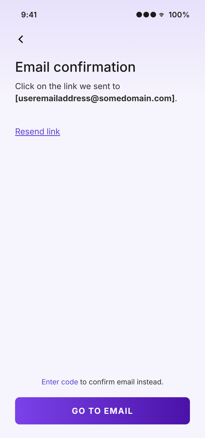
Email confirmation
Click on the link we sent to [useremailaddress@somedomain.com].
Resend link
Enter code to confirm email instead.
Straightforward headline, decluttered content, deprioritized secondary actions, and dropped “let’s” to prioritize clarity.
Reflection
Applications can be a vanity metric. Just because someone applies doesn’t mean they’ll use the account or put money in it, which is why F30 also tracked debit card activations and direct deposits. Next, I’d explore how to increase engagement after sign-up, and test reintroducing steps (like the savings account) to see whether they affect drop-off.